Labs: Picking visualization
We like to experiment with new ideas and concepts and will prefix post titles for these experiments with “Labs”. Our latest experiment focused on trying to optimize the pickers efficiency even further by introducing visual cues.
Theory
The theory behind the idea lies in the cognitive term visual search. When we search for objects in our surroundings, things that stand out from the mass ceases our attention in munch less time and with less effort than when trying to find something among objects that are similar to each other. The more distractors of a similar kind there are in the search area, the bigger the effort and search time becomes.
In relation to picking in warehouses, the information regarding where to search for an item are often provided in letters and numbers in different combinations. One example of how product placement can be described in a warehouse is “PLE02A02”. Deciphering this kind of information takes a lot of mental effort. Adding more numbers to the information, such as number of items to pick and the number of the bin(s) in which to place the item(s), increases the effort even further.
Concept
What happens in the pickers mind when they are presented with this information is that they try to match it against their mental model of the warehouse. Connecting “PLE” to isle, “02” to shelf number, “A” to shelf level and “02” to placement on the shelf. At the same time they are separating that information from the number of items to pick and where they should be placed after picking. Doing this over and over again during their work day quickly drains their mental energy.
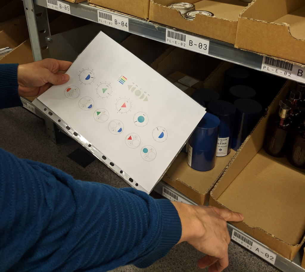
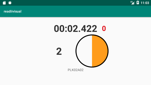
Through our picking visualization concept we aimed at reducing this mental mapping and create a distinct separation between similar concepts. As a first step, we have focused on reducing the written information in the previous example, replacing it with shapes and colours. Instead of “PLE02A02” we only provide information regarding what shelf to pick from, in this case “E2”. Next to the shelf number, we show a filled blue half-circle. The colour represents the level of the shelf, in this case “A”, and the filled half-circle represents the item to the right from the middle position on that shelf, item placement “02”.
Experiment
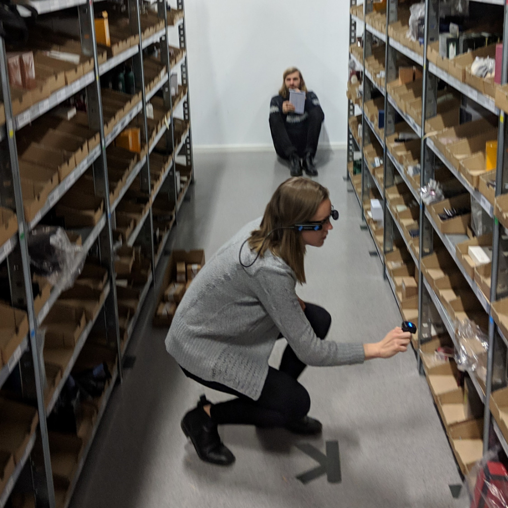
During our development of the concept we tried several different shapes and colour combinations, before arriving at our final setup. This was evaluated both through tests at our office space and a more thorough experiment in a real warehouse.
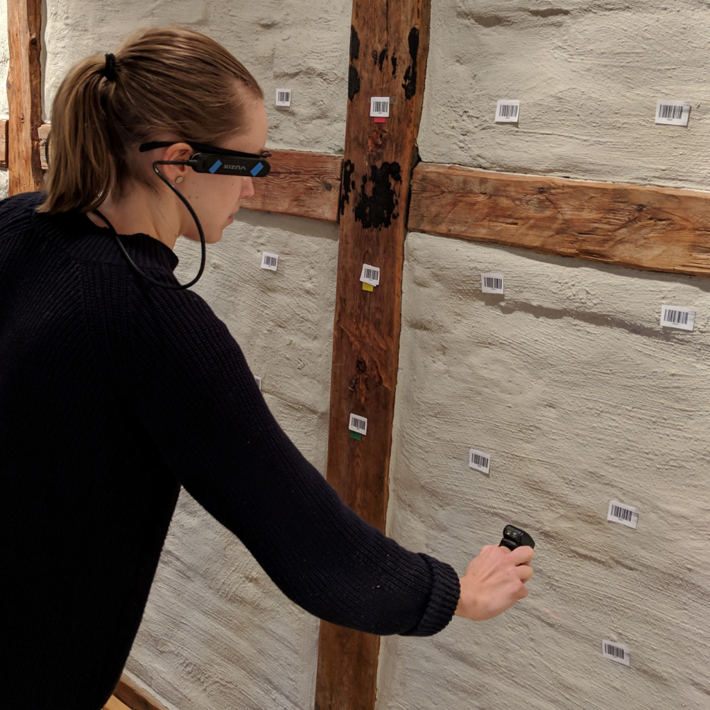
In our experiment at the warehouse we used 6 different shelf levels (A-F) with 5 positions on each shelf level (1-5). We replaced the six different shelf levels with 6 different colours, each representing a level. We labelled each shelf level with its designated colour, to enable identification from glass to real world. To identify the placement of the items on the different shelf levels we used three different shapes, corresponding the item either being placed in the middle, next to the middle or furthest away from the middle. In this way position three is always represented by a full moon, 2 and 4 by half-moons aimed in opposite directions and 1 and 5 new moons, also aimed in opposite directions.
Results
To evaluate the effectiveness in identifying correct item placement with the different location representations, we randomized the two different representation styles in 60 picking rounds. We identified 12 items in each round and 30 rounds with the original representation style, with letters and numbers, and 30 rounds with the representation style using colours and shapes. Picking times were then compared between the representation styles, showing on average a 14% increase in effectiveness using the shapes and colours.
In addition to the effectiveness measurement all the test participants reported to feel less mentally strained and thereby prefer the picking visualization concept, in relation to the original representation.
Picking times were then compared between the representation styles, showing on average a 14% increase in effectiveness using the shapes and colours.
The results are an initial proof that the theory behind the experiment is applicable in this particular setting. We will continue explore the possibilities it brings, both in relation to effectiveness and i relation to mental demand. But by now, you should have figured out that they are tightly intertwined, and improving one includes improving the other.